TechTool
» Statics 23
» Statics 22
» Statics 21
» Statics 20
» Statics 19
» Statics 18
» Statics 17
» Statics 16
» Statics 15
» Statics 14
» Statics 13
» Statics 12
» Statics 11
» Statics 10
» Statics 9
» Statics 8
» Statics 7
» Statics 6
» Statics 5
» Statics 4
» Statics 3
» Statics 2
» Statics 1

The World of Statistics – 4
Graphical Representation of Statistical Data
By Dr. Magdi Abadir, PhD
1. Representation of Grouped Data
In general, a graphical representation of data throws better insight on the nature of the distribution of the variable. First, it is important to note that it is more convenient to deal with grouped data to carry out graphical representations. To that aim, let us recall the table introduced in the last article concerning the age categories of guests at a reunion.Table 1: Distribution of age categories
| Category | [20; 30) | [30; 40) | [40; 50) | [50; 60) | [60; 70) |
| Frequency f | 5 | 8 | 7 | 4 | 1 |
There are several methods that can be used to that aim, the most commonly used are reviewed in that article and the following one.
2. Histograms
In a histogram, the class intervals are plotted on the horizontal axis while the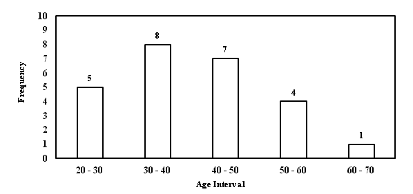
corresponding frequency shows on the vertical axis (Figure 1).
Fig 1: Histogram for age distribution
3. Frequency Polygons
This is a chart where the frequency values are simply plotted against the mean value of each class interval (Figure 2).One merit of graphical representation is that a single glance is sufficient to tell that most of the people present at the party have their ages in the 30 – 40 category and that those whose age lies in the 50 + category is much fewer.
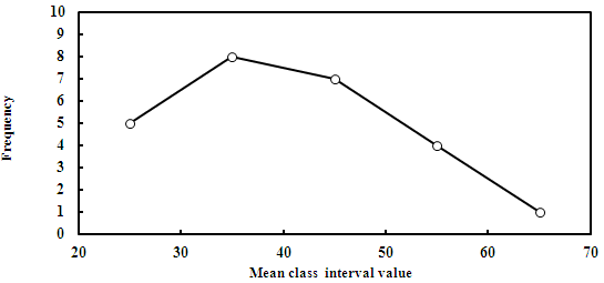
Fig 2: Frequency polygon
4. Pie Charts
One common method used to visualize the distribution of data is the pie chart. This consists of a circle the surface of which is divided into sectors. The central angle of each sector denotes the frequency as percentage. For example, referring to Table-1, the percentage of each age category is obtained by dividing the value of frequency by the total number of attendees, then transforming to percentage by multiplying by 100. The total number = 5 + 8 +7 + 4 +1 = 25, so that the percentage of the first category = 5/25 ×100 = 20% and so on. Table 2 shows the calculated percentages while Figure 3 illustrates the corresponding pie chart.To draw the pie chart, one first draws a circle, then divide it into 5 sectors (corresponding to the 5 age categories), each at a central angle θ calculated from the formula:
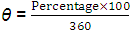
Table 2: Percentages of age categories
| Category | [20; 30) | [30; 40) | [40; 50) | [50; 60) | [60; 70) |
| Frequency f | 5 | 8 | 7 | 4 | 1 |
| Percentage | 20 | 32 | 28 | 16 | 4 |
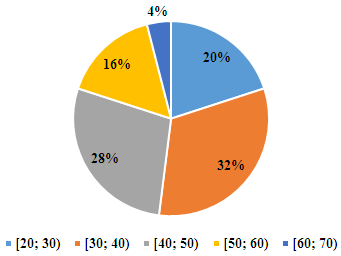
Fig3: Pie chart
Reference
Hoel P.G. (1976). "Elementary Statistics" 4th Ed., Reading, Mass.: Wiley Int. Edition, Chapter 2
| Dr. Magdi Fouad Abadir, Ph. D.: Dr. M. F. Abadir is currently a professor with the Chemical Engineering Department at the Faculty of Engineering, University of Cairo, Egypt. His major interests are in the fields of high temperature science and technology. During his career, he has supervised more than 110 MSc and PhD theses and published more than a hundred papers mostly in international peer review journals. He currently teaches courses in High Temperature Technology and Industrial Statistics. He is also a consultant for several industrial businesses. |


